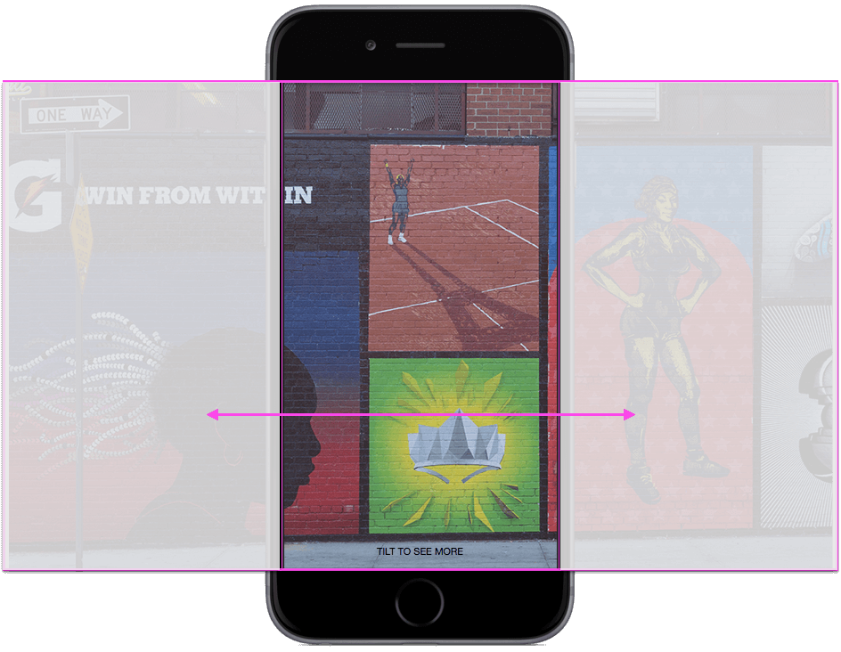
Canvas adds an immersive experience and allows clickable, full-screen, mobile-optimized posts to display a combination of images, videos, text blocks, and links.
Advertisers can create a Canvas in the Canvas Editor (which can be found in the Publishing Tools area of their Page). Once completed, you will receive a link to use on your website and in website conversion ads.
People who tap on a post created with Canvas on their mobile phone or tablet can interact with the interface using taps, tilts, and swipes of the screen, without leaving Facebook. Canvas can also link to your website, where people can learn more about your business or purchase items featured in the Canvas.
You can see examples of Canvas usage here.
Getting Started
One of the advantages of Canvas is how customizable it is to user preferences. Because of this, there is no single way to create a Canvas. Here, you will find a guide to the initial steps required for every Canvas. Afterwards, we will guide you through adding all component types.
Tip: Before you start, remember that best practice is to think about what kind of experience you want to create for your customers, and prepare your creative assets in advance.
Go to the Page that will be associated with the ad you are connecting the Canvas to.
Click on Publishing Tools.
Click on Canvas.
Click on + Create.
Edit the new document field to type a name for your Canvas.
Note: The name of your Canvas will not be shown to people viewing the ad. It is for your own use, to distinguish this Canvas from other Canvases. It works just like a file name.
Click the dropdown next to ‘Select a theme’ and choose the type of background you want for your Canvas.
Adding Components
Later in the article, you will find details on how to add each of the components. Remember that components are not mandatory and can be added in almost any order. Check the design recommendations for each component for more information.
Tips:
You can add multiple components at once by clicking the Add Component button, selecting all the component types you want to add, and clicking OK.
While creating the Canvas, use the preview on the right side of the Canvas editing screen to make sure you are satisfied with the look.
Adding a Header
A header is an image that appears (and stays fixed) at the top of your Canvas. If it doesn’t fit the width of the screen, you can choose a background color to fill the empty space. Unlike other Canvas components, you can only display one header at the top of the Canvas.
Note: When you create a new Canvas, one of its default components is the header. However, having a header in the Canvas is not mandatory. You can delete it by clicking the trash can icon in the header component area.
To add a header to your Canvas:
Click the Add Component button
Select Header
Click OK
Click the Upload Image button and select the image you want to upload.
Adjust the Background Color and Opacity fields as needed.
Adding an Image
A photo is a single image that you can add to your Canvas.
Note: When creating a new Canvas, one of the default components is a photo. However, you do not have to add an image to the Canvas, and you can delete the component by clicking the trash can icon in the photo component area.To add an image to your Canvas:
Click the Add Component button
Select Photo
Click OK
Click the Upload Image button and select the image you want to upload.
Choose how you want the image to be displayed on the screen.
Adding a Button
Buttons contain links that take people who click on them outside of Facebook and your Canvas, to the website you type in the button’s link field.
Note: When you create a new Canvas, one of the default components is a button. However, you do not have to add a button to the Canvas, and you can delete the component by clicking the trash can icon in the button component area.To add a button to your Canvas:
Click the Add Component button
Select Button
Click OK
Fill in the button text (what will be written on the button), the button link (the website you want people to go to upon clicking), and the button color.
Adding a Carousel
A carousel is a series of “cards” with images and (sometimes) links that people viewing your Canvas can scroll through. All images must be the same size. Each card will contain the same link or different links. Tapping an image will take people to the linked website.
Important: If you want to add a link to a card in the carousel, you must choose the ‘Fit to width’ option for the image on that card.Tip: In the preview on the right side of the Canvas editor, you can click, hold, and drag the carousel to browse the cards displayed in it.To add a carousel to your Canvas:
Click the Add Component button
Select Carousel
Click OK
Add cards (you can add up to ten cards) or remove them (you can leave just one card) until you reach the desired quantity.
To add cards to the carousel, click the plus button.
To remove a card from the carousel, select the number of the card you want to delete and click Remove.
On each card, click Upload Image and select the image you want to upload.
Tip: If you want to change the card’s image, click Update Image.
Choose whether you want the images to fit to the width or height of the screen on the device of the person viewing the Canvas.
Note: Any selection you make affects every card in the carousel. You can modify your selection on any card to change the selection across all cards.
If you select ‘Fit to width’ and want to add a link, click Add link and enter the URL in the appropriate field (optional).
Adding a Text Block
A text block is a place where you can add text to your Canvas.
To add a text block:
Click the Add Component button
Select Text block
Click OK
Type the text you want to add and format it as needed.
Adding a Video
A video is a place where you can display a video clip on your Canvas.
To add a video to your Canvas:
Click the Add Component button
Select Video
Click OK
Click Upload Video and choose the video file you want to upload.
Choose how you want the file to be displayed.
Arranging Your Components
After adding all the components you want to the Canvas, you can change the way they are arranged by clicking the up and down arrow icons next to each component. You can also click the trash can icon to delete a component.
Finishing Up
Make sure to click Save Draft during the Canvas creation process so you don’t lose your work. You can also save your work and finish it at a later stage.
What are the design recommendations for Canvas components?
Canvas is a new feature currently in testing. It may not be available to you yet. To request early access to Canvas, fill out the form at the link.
There are six types of components you can add to your Canvas. Later in the article, you can find a list of them along with notes for each. Remember that generally, we recommend not including more than 3–5 screens per Canvas.
Learn how to create a Canvas.
General
In addition to the specific recommendations listed below, here are some general recommendations:
Show the product, company name, or logo on the first screen of your Canvas so that people are oriented and know how the Canvas relates to the ad they clicked on.
Include a button linking to your website at the bottom of your Canvas so that people who want to can get more information.
Headers
Use an image no larger than 882 pixels by 66 pixels.
Use PNG format.
Use a transparent image.
Images
A single Canvas includes up to 20 images.
You can use PNG or JPG files.
A full-width image is 1080 pixels wide, but you can use wider images if you choose the display option Fit to height (tilt to fit)
A full-height image is 1920 pixels high, but you can use a taller image if you choose the display option Fit to width (tap to expand).
Videos
Use videos with a resolution of at least 720p.
You can use multiple videos in your Canvas, but their total runtime cannot exceed 2 minutes.
To prevent playback competition, do not place two auto-playing videos on the screen at the same time.
Create videos for your Canvas while holding the camera vertically (portrait).
Note: Videos shot with the camera held horizontally (landscape) will automatically resize and display vertically (portrait). This causes them to shrink and appear with black bars on each side.
Do not make your videos full screen.
The first frame of your video serves as the thumbnail.
Buttons
Buttons can be filled with color or outline-only, so that the background color shows through.
Buttons should be 48 pixels high, with 48 pixels of spacing above and below them.
You cannot enter more than 30 characters in a button.
The font can be Serif or Sans Serif.
Text Blocks
You can type up to 500 words in a text block.
The font can be Serif or Sans Serif.
Font size should be between 6 points and 72 points.
Font color is #rrggbb.
Font style can be bold, italic, or underlined, but it applies to the entire block, not individual words.
Text can be left-aligned, right-aligned, or centered.
The Canvas must not exceed 1000 words in total.
Carousel
All images must be of uniform size.
A carousel can contain up to 10 images.
Images can be full height or partial height.
The dots indicate your position in the carousel and always appear along the bottom edge. They cannot be removed.
A Little About Me:
Or Fialkov is the CEO and owner of Fialkov Digital, a digital marketing and advertising agency. He runs paid campaigns on Google, Facebook, Instagram, YouTube, LinkedIn, and TikTok, and builds websites and landing pages. He also implements AI in businesses, including AI agents, agentic marketing automation, AI reporting systems, GEO (Generative Engine Optimization), and AI video for campaigns.